
HOWTO: Dark Mode README Logo on GitHub
Published
I recently decided I wanted a dark-mode-specific logo for the GitHub README on one of my personal projects. It turned out to be far less trivial than I hoped. Read on.
My initial try was simply adding a <style> to the README.md that targeted the [data-dark-theme*="dark"] selector, which is a side effect of GitHub’s Primer CSS design system. This simply doesn’t work because GitHub doesn’t allow CSS in the README.
However, it seemed that by leveraging the power of SVG it’s still possible to embed CSS, albeit indirectly. Sindre Sorhus has a slick demo.
It took some iterations of trial and error, but I finally got something that worked. Pitfalls included:
- Forgetting
<img>tags need to be self closing in XHTML i.e.<img /> - Deciding to just inline the image as a
data:image/pngbase64 encoded string - Finally, forgoing the
[data-dark-theme]and just using@media (prefers-color-scheme: dark)
All said and done, here’s the resulting logo.svg that lives in the docs/ directory:
<svg fill="none" viewBox="0 0 400 300" width="400" height="300" xmlns="http://www.w3.org/2000/svg">
  <foreignObject width="100%" height="100%">
    <div xmlns="http://www.w3.org/1999/xhtml">
      <style>
        @media (prefers-color-scheme: dark) {
          img {
            filter: invert(1);
            background: none;
          }
        }
      </style>
      <div align="center">
        <img width="256" src="data:image/png;base64,omitted+for+brevity==" alt="bic"/>
      </div>
    </div>
  </foreignObject>
</svg>
Which is then used in the README like so:
<div align="center">
  <img width="400" src="docs/logo.svg" alt="bic">
</div>
It’s worth noting that my “dark mode” image is the original inverted via CSS. I don’t mind this, but admittedly it’s imperfect for all applications.
Here’s the before:
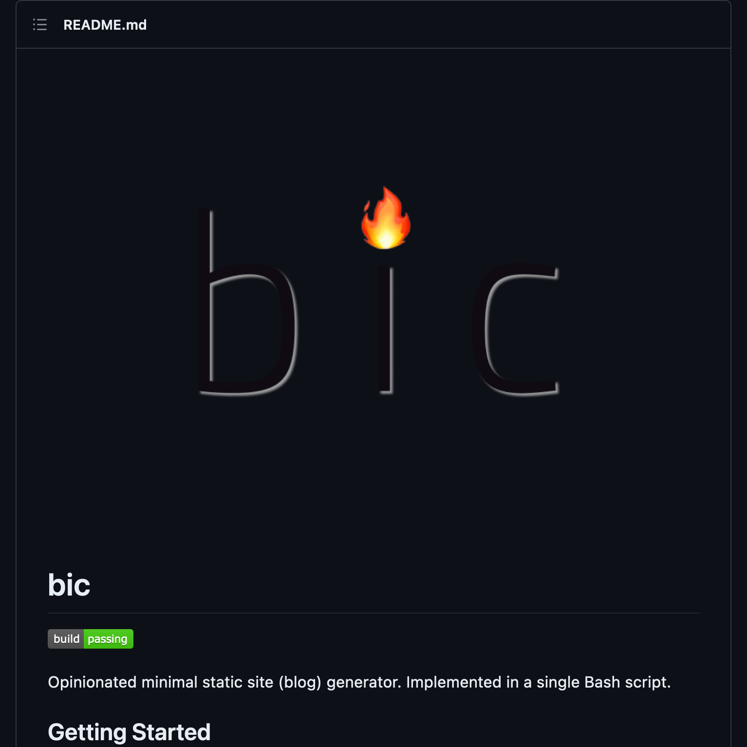 The bic readme before. Not awful.
And here’s the after:
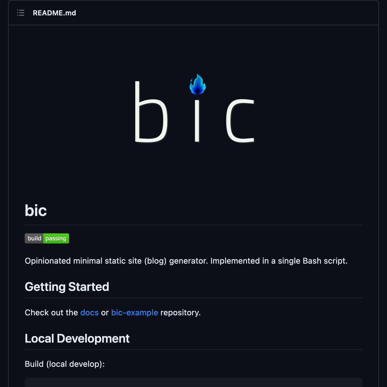 The bic readme after. Yes, the logo did shrink.
Pretty neat.
I love hearing from readers so please feel free to reach out.